Featured project
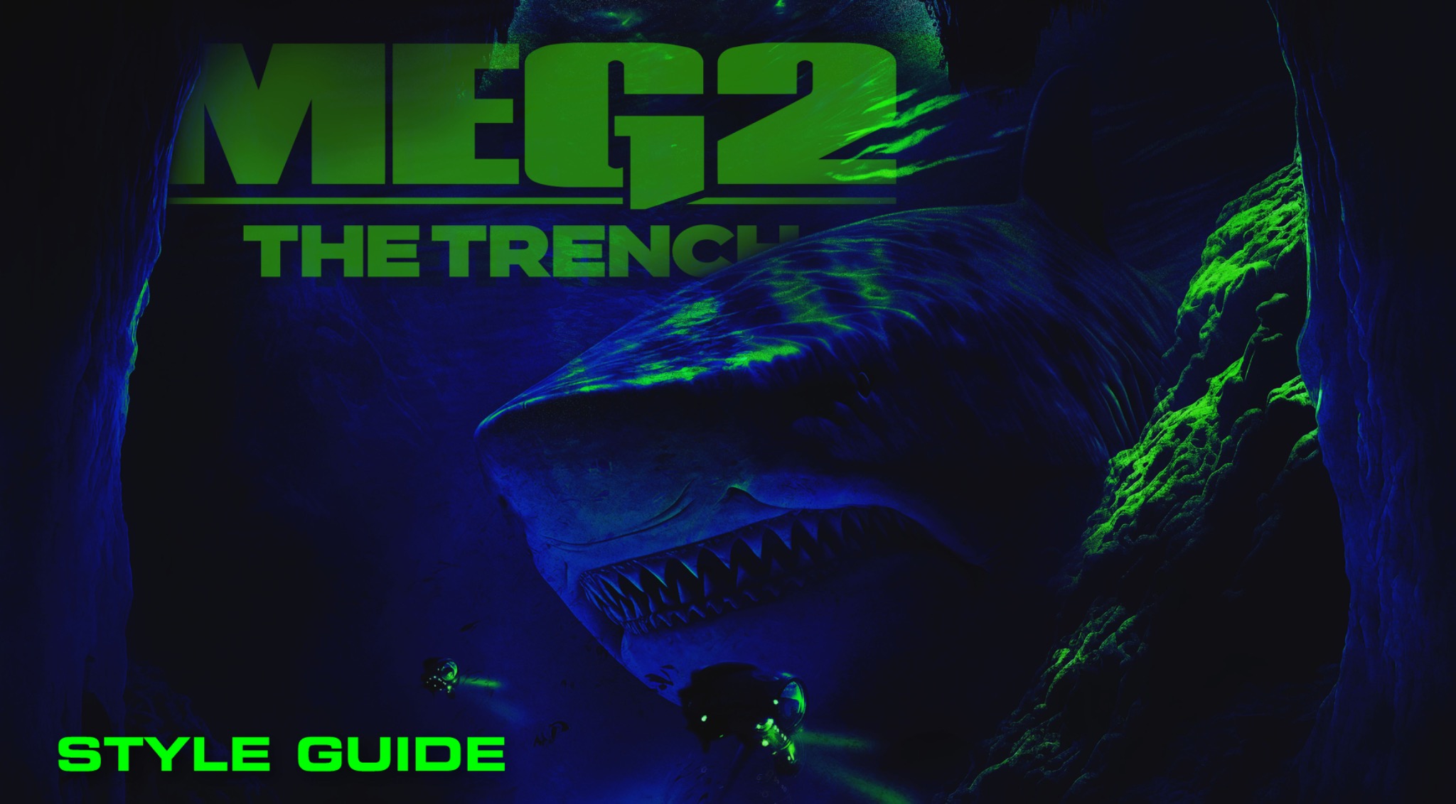
MEG 2: THE TRENCH | BRAND STYLE GUIDE
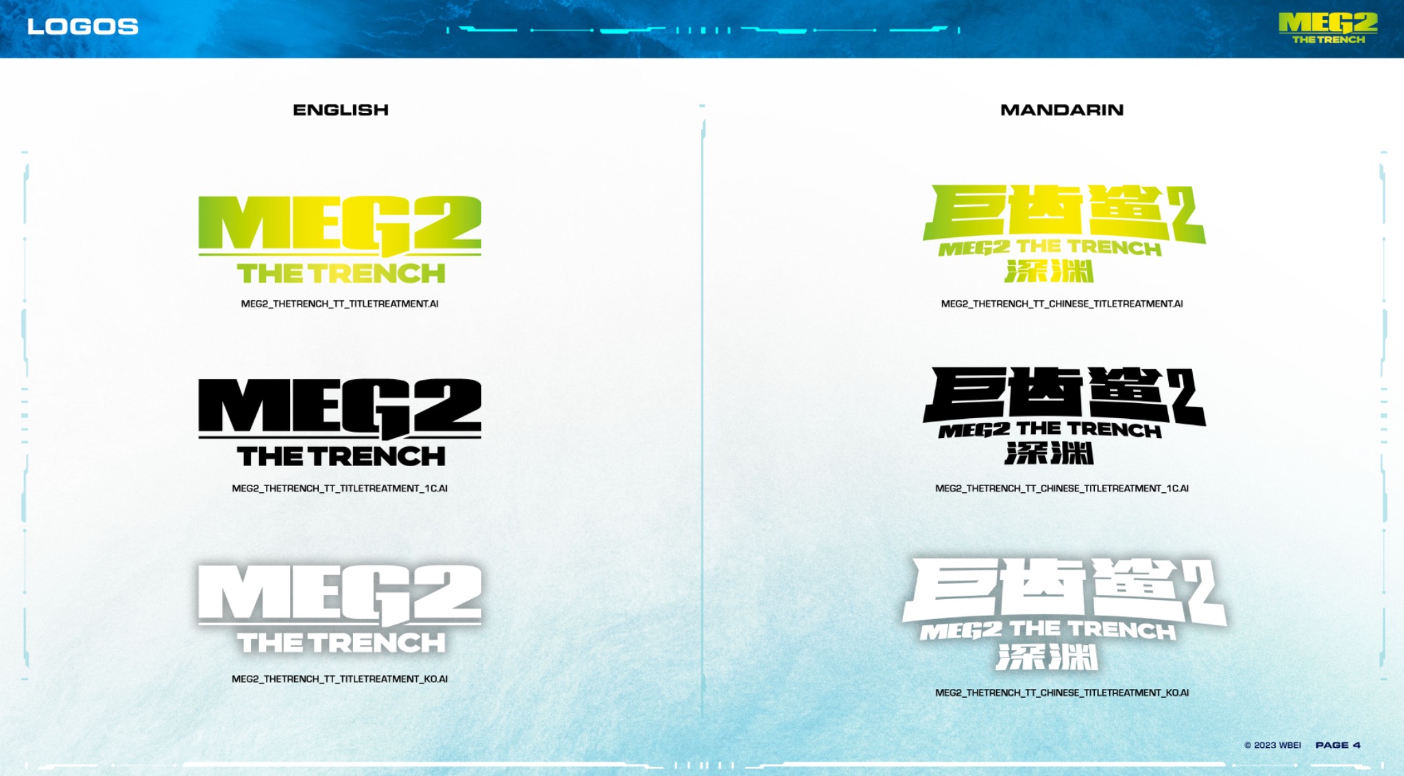
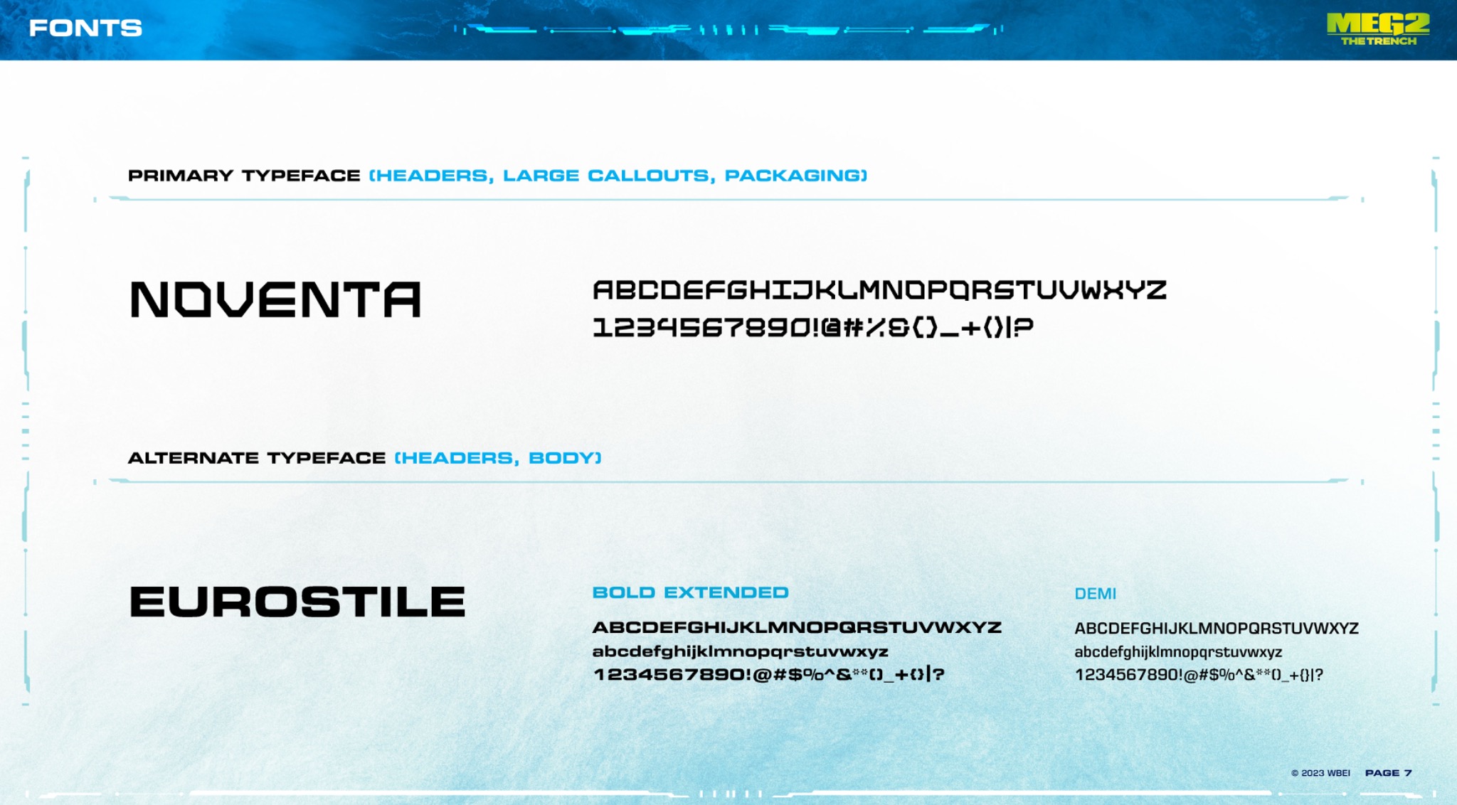
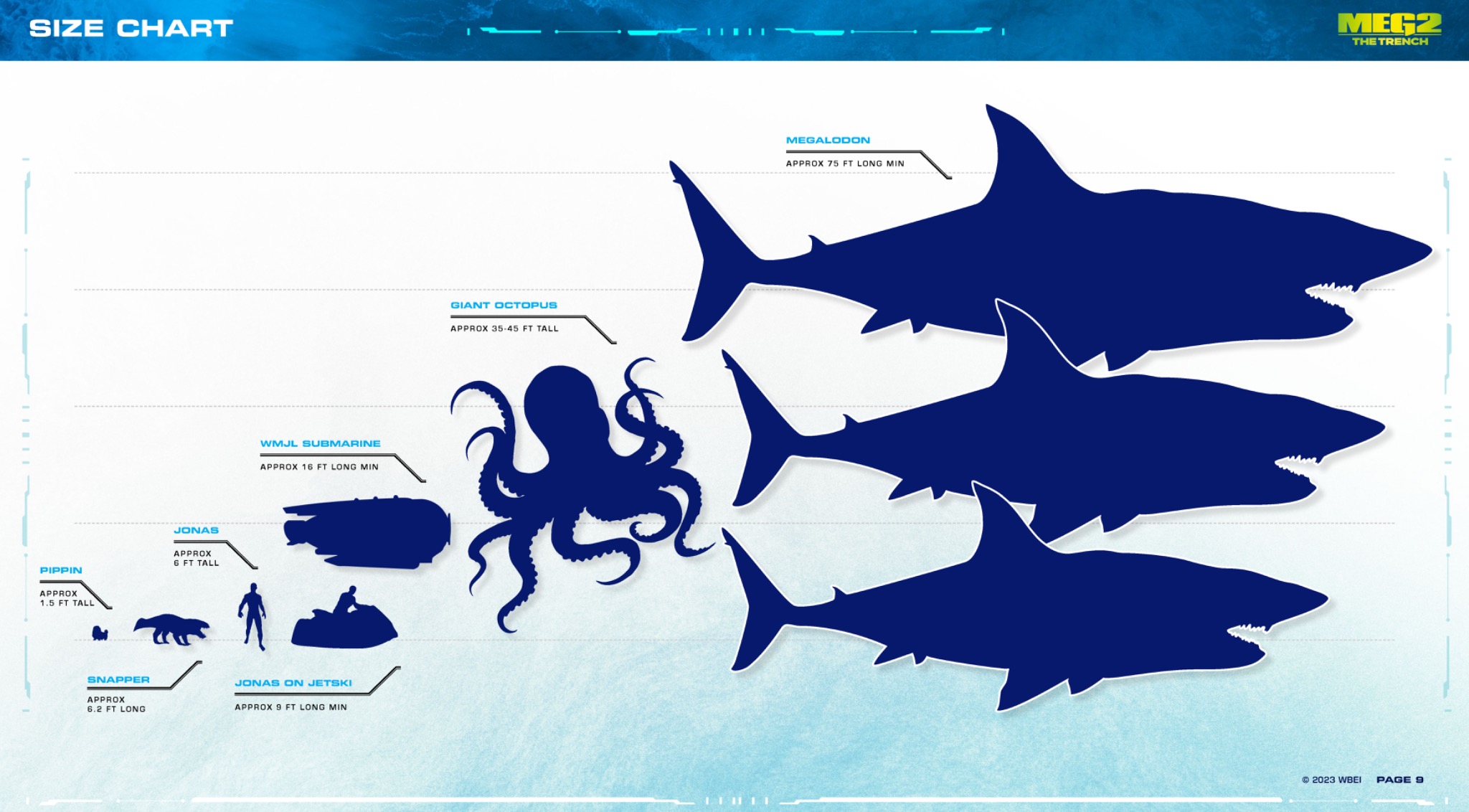
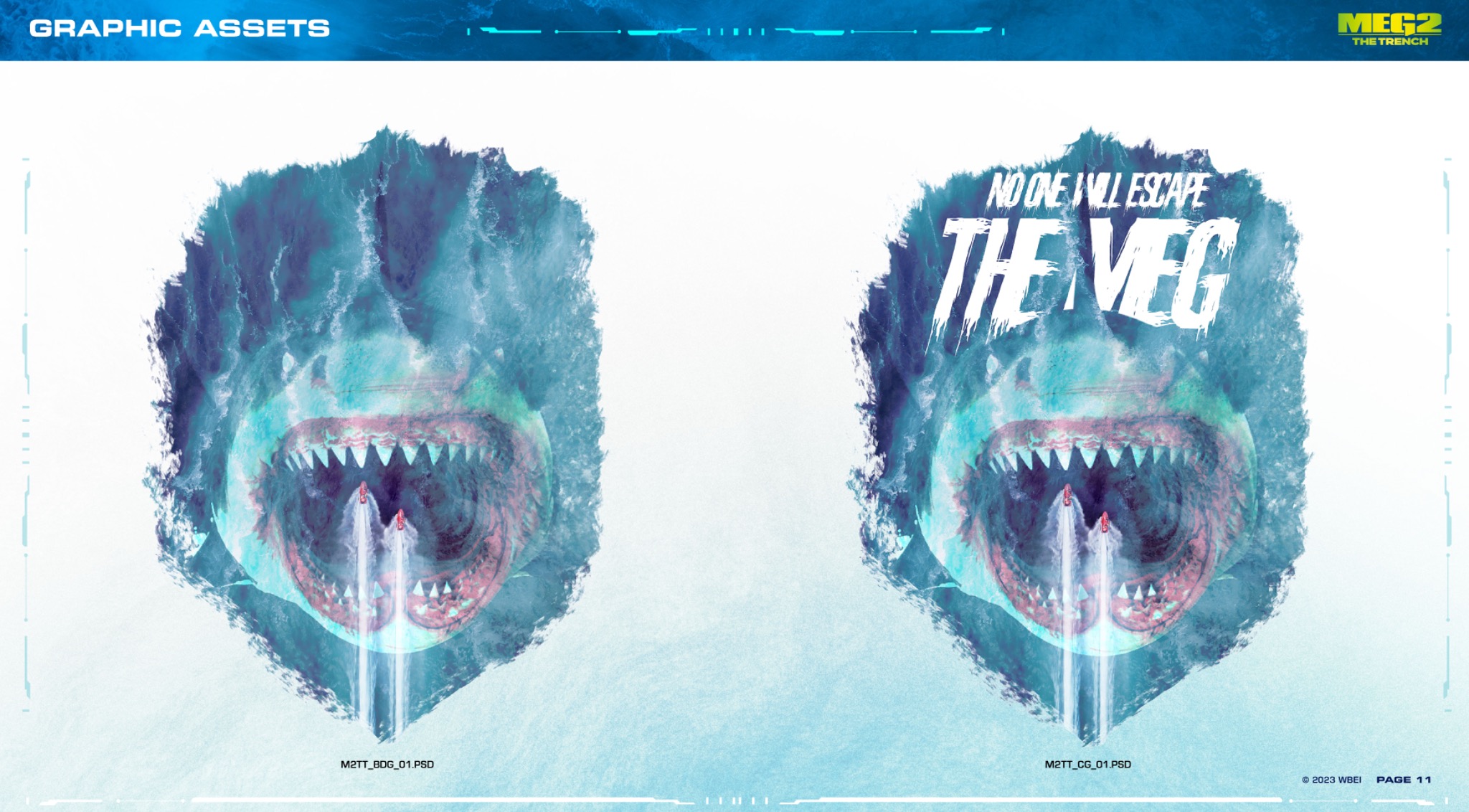
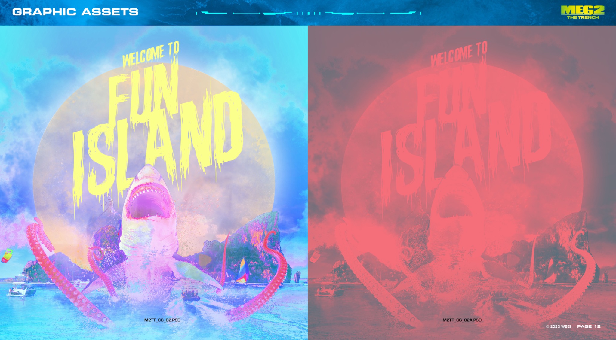
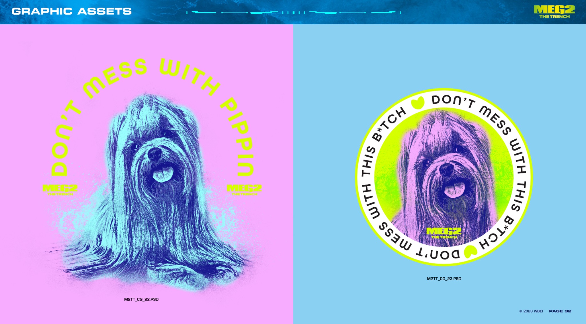
Selected pages bring the film’s visual identity together through English and Mandarin title treatments, type specifications, a creature scale chart, and graphic assets.
Brand systems that give creative teams a clear direction, and presentations that make the idea tangible. Selected work across character guides, visual assets, product applications, and retail pitches.
Selected pages bring the film’s visual identity together through English and Mandarin title treatments, type specifications, a creature scale chart, and graphic assets.
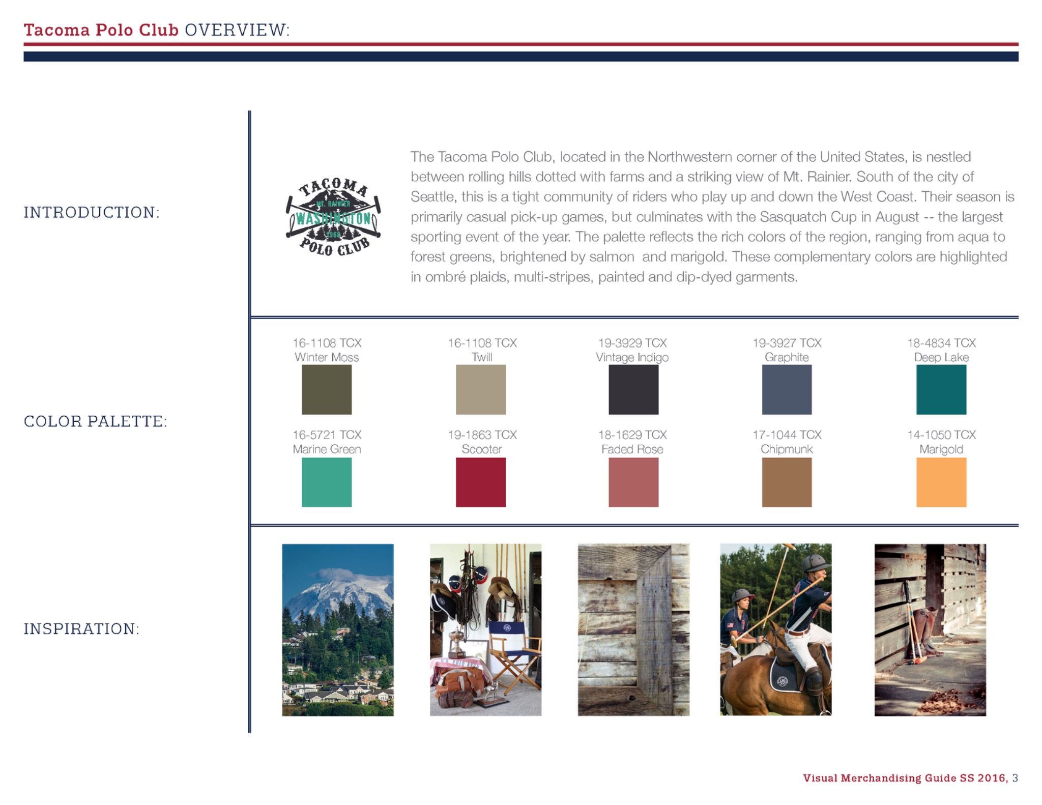
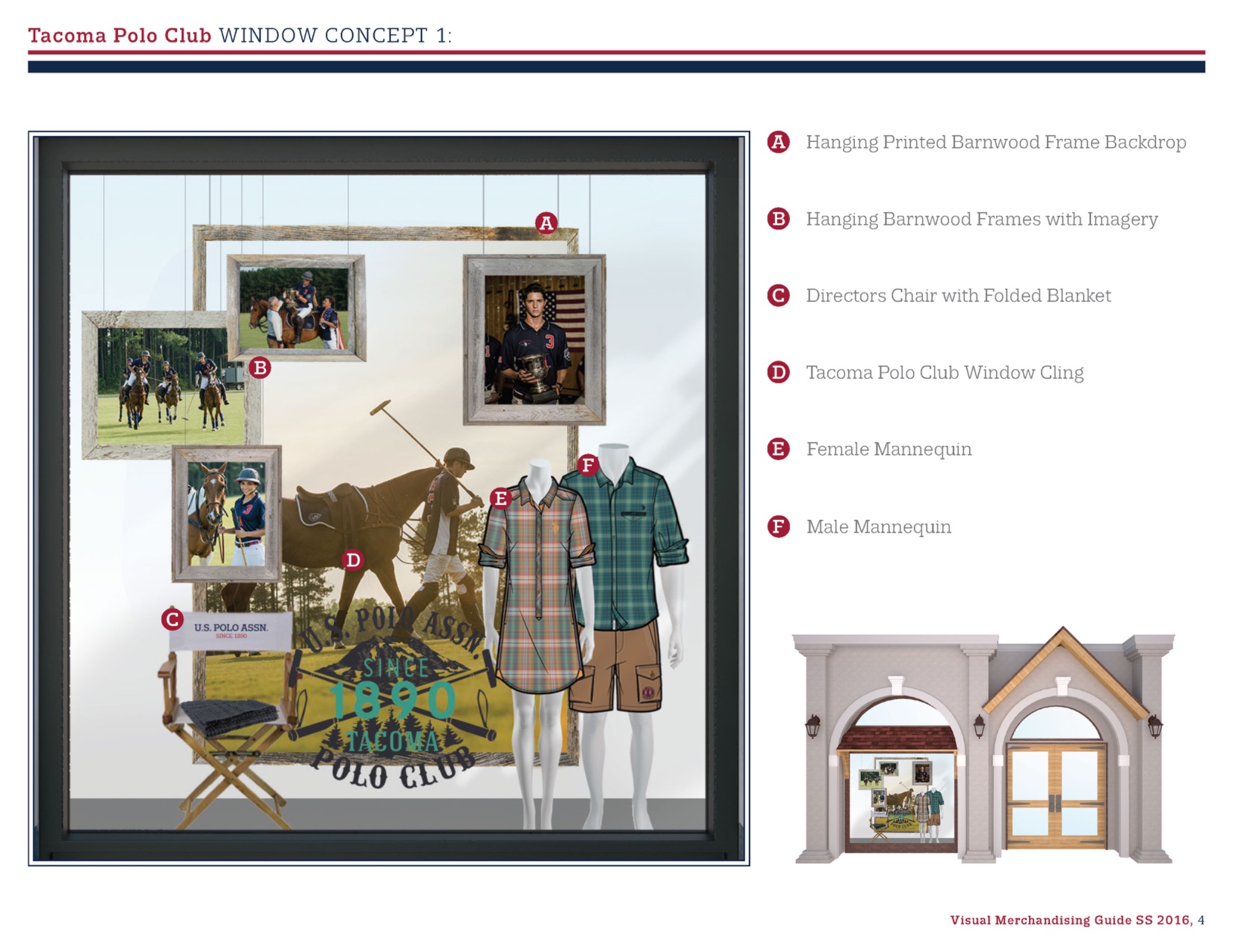
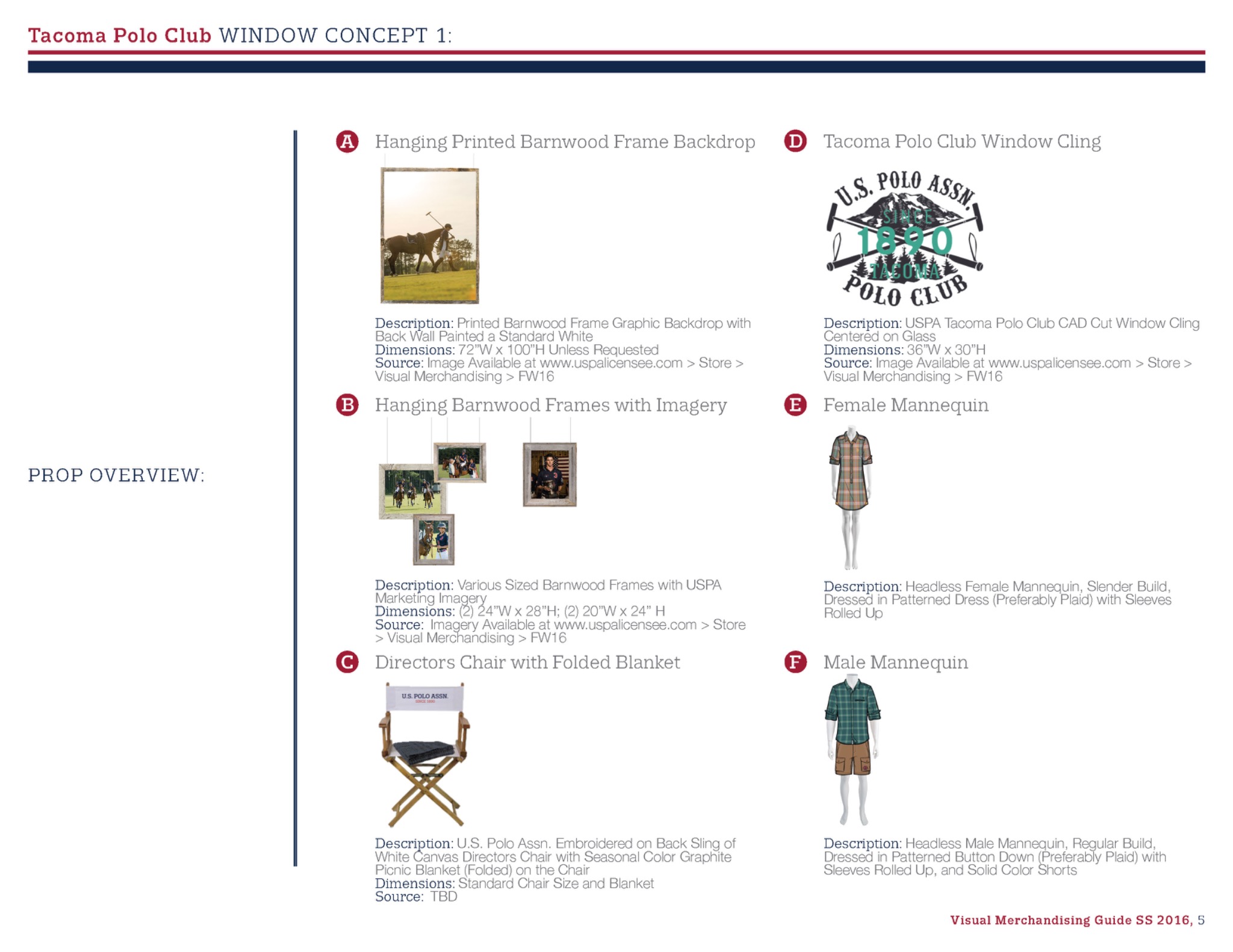
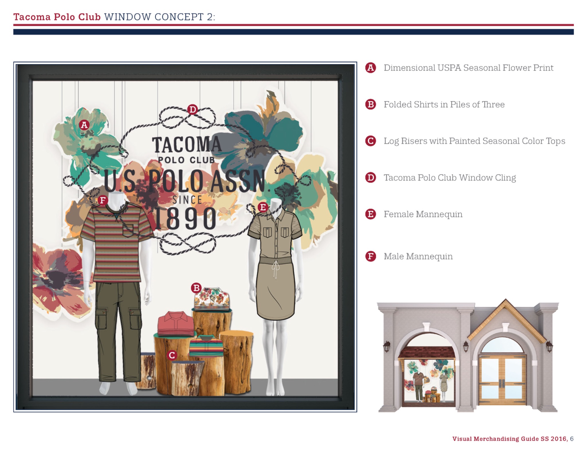
Selected pages from the Spring/Summer 2016 guide show how the Tacoma Polo Club story translates from a seasonal palette and mood references into two storefront concepts, with annotated layouts and prop specifications.
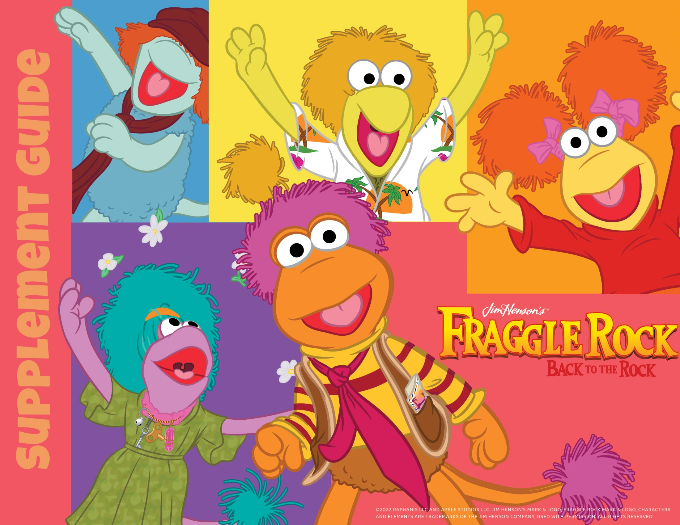
A flexible visual language connects brand marks, color, character poses, and themed product stories. The guide carries the personality of Fraggle Rock into assets and applications that creative partners can work from.
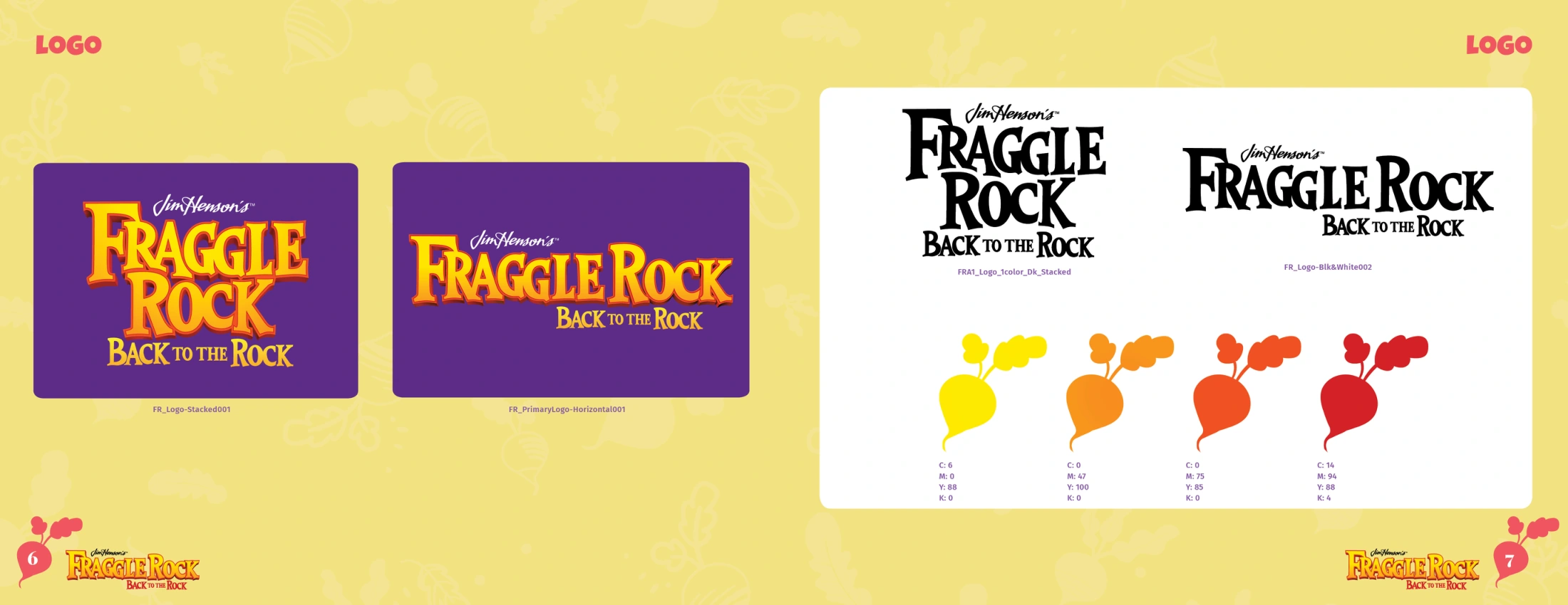
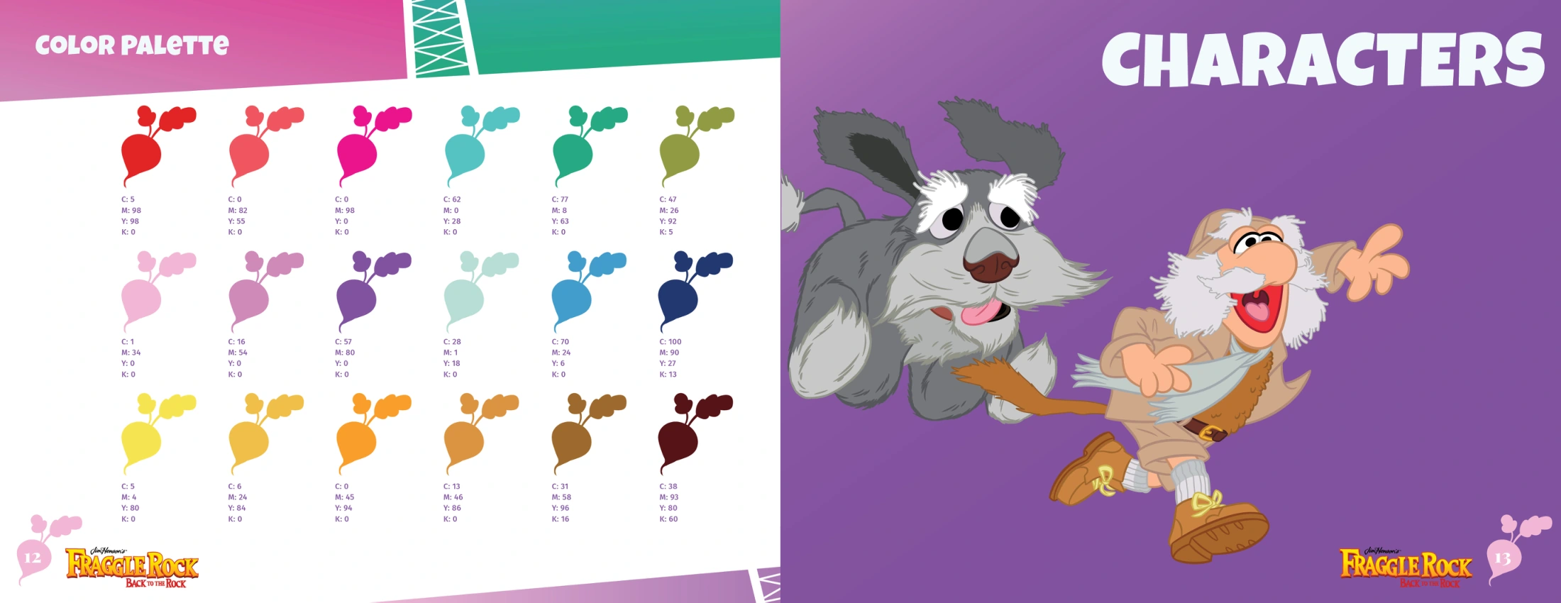
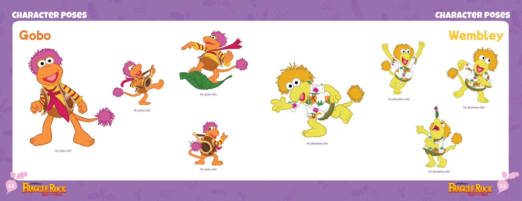
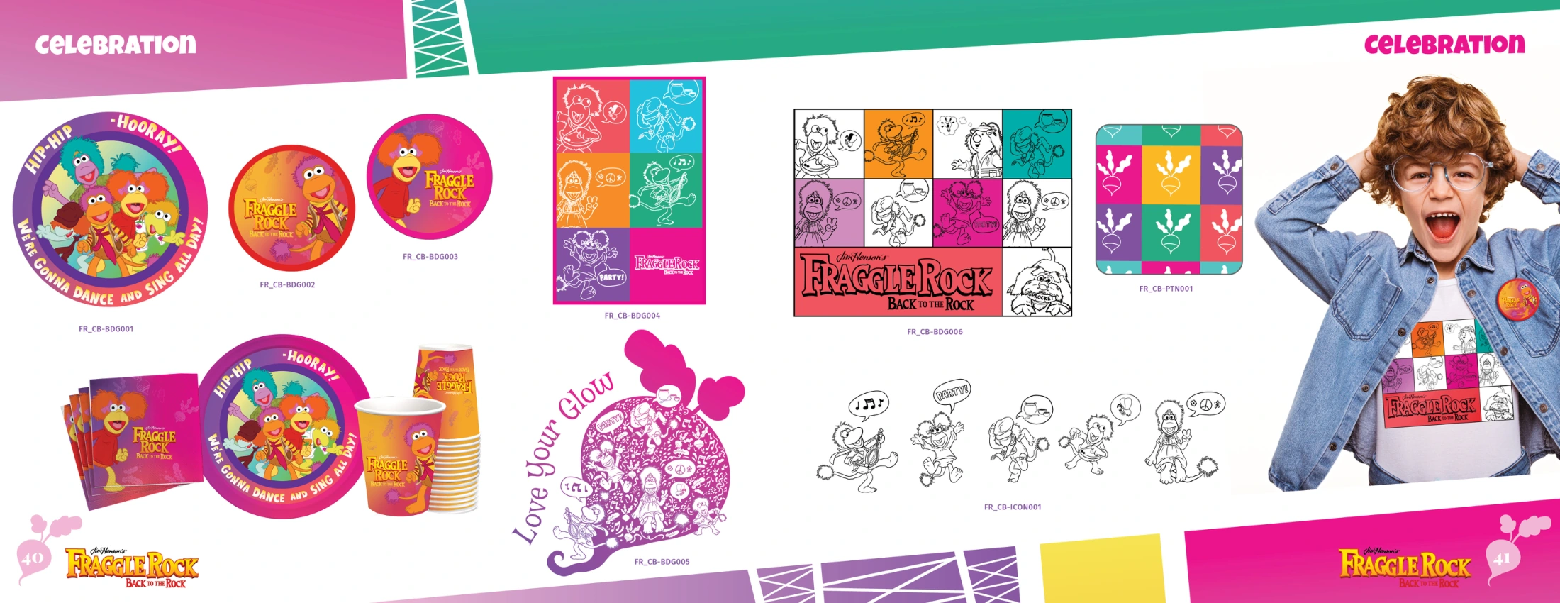
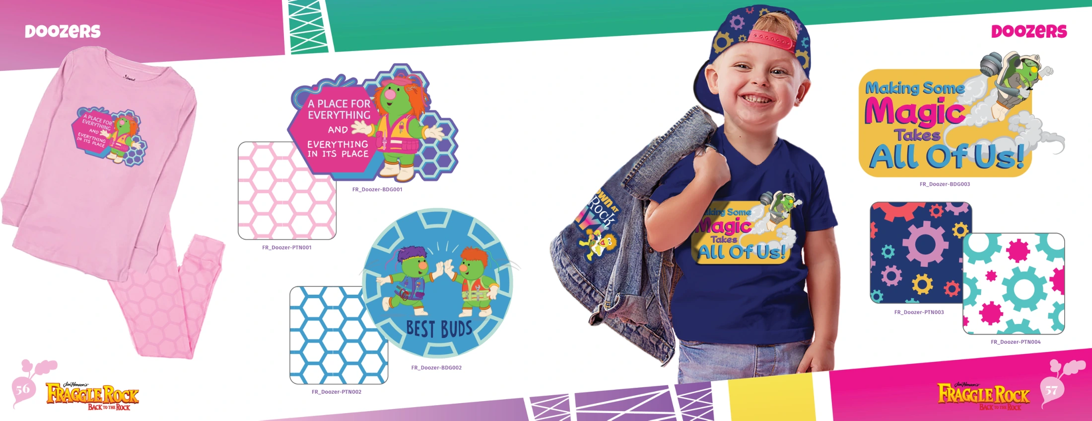
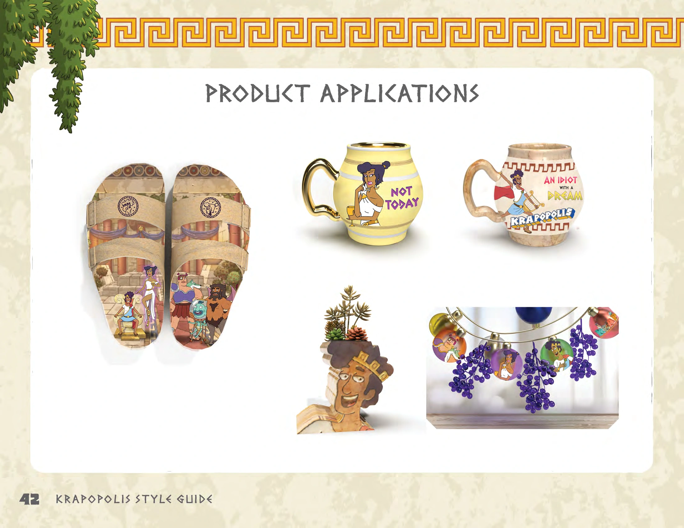
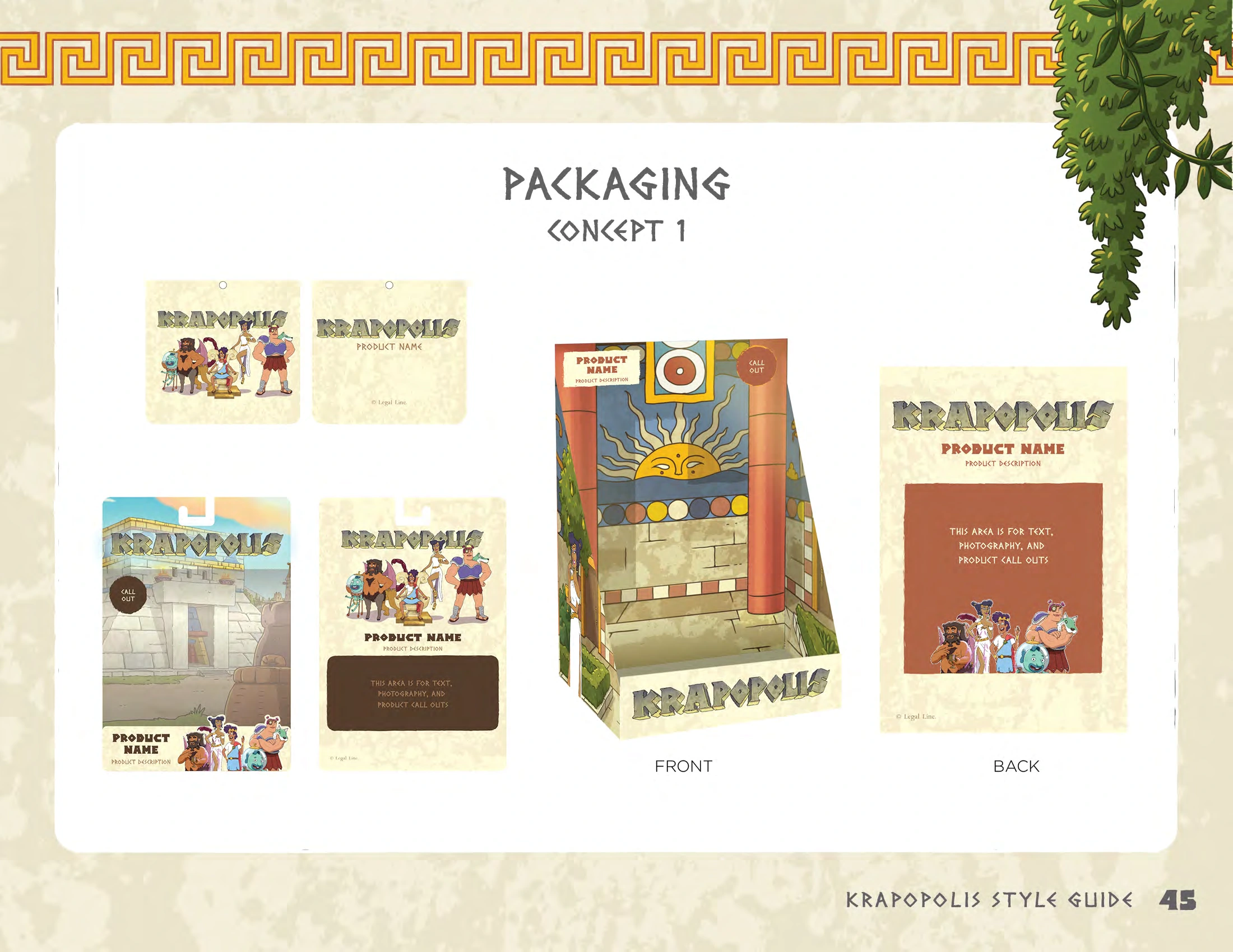
Logo treatments, character poses, color specifications, repeat patterns, and packaging work together as one guide. Selected pages show how the property’s visual world extends across graphics, merchandise, and licensed products.
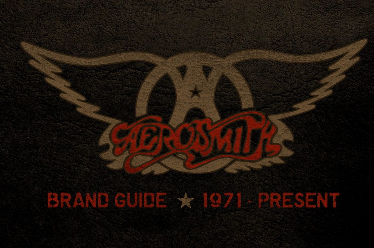
The Aerosmith brand-guide cover pairs the iconic winged mark with rich texture and a restrained rock palette. It establishes a visual tone that connects with the campaign and retail concepts below.
Pitch visuals connect campaign messaging with music, apparel, digital storefronts, and physical retail. The mockups show how a shared creative direction can carry across the shopping experience.
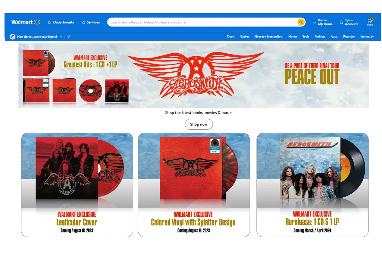
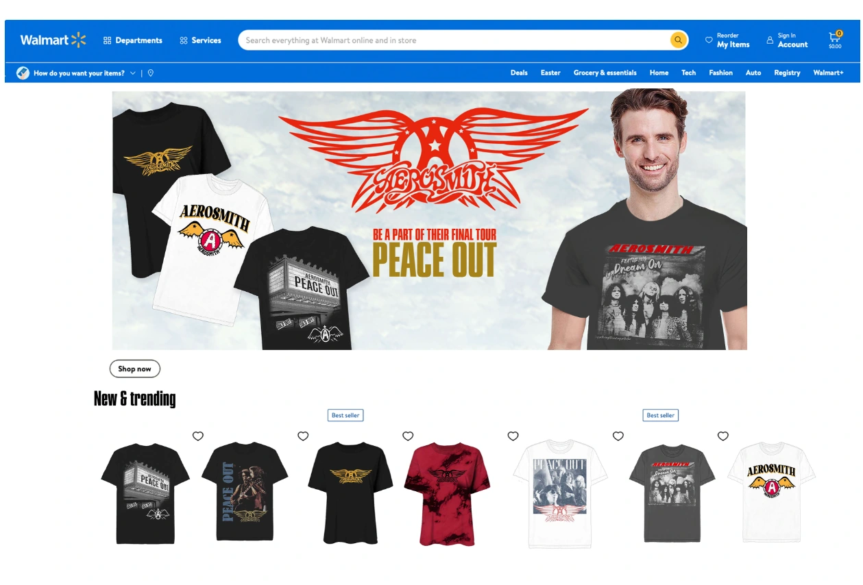
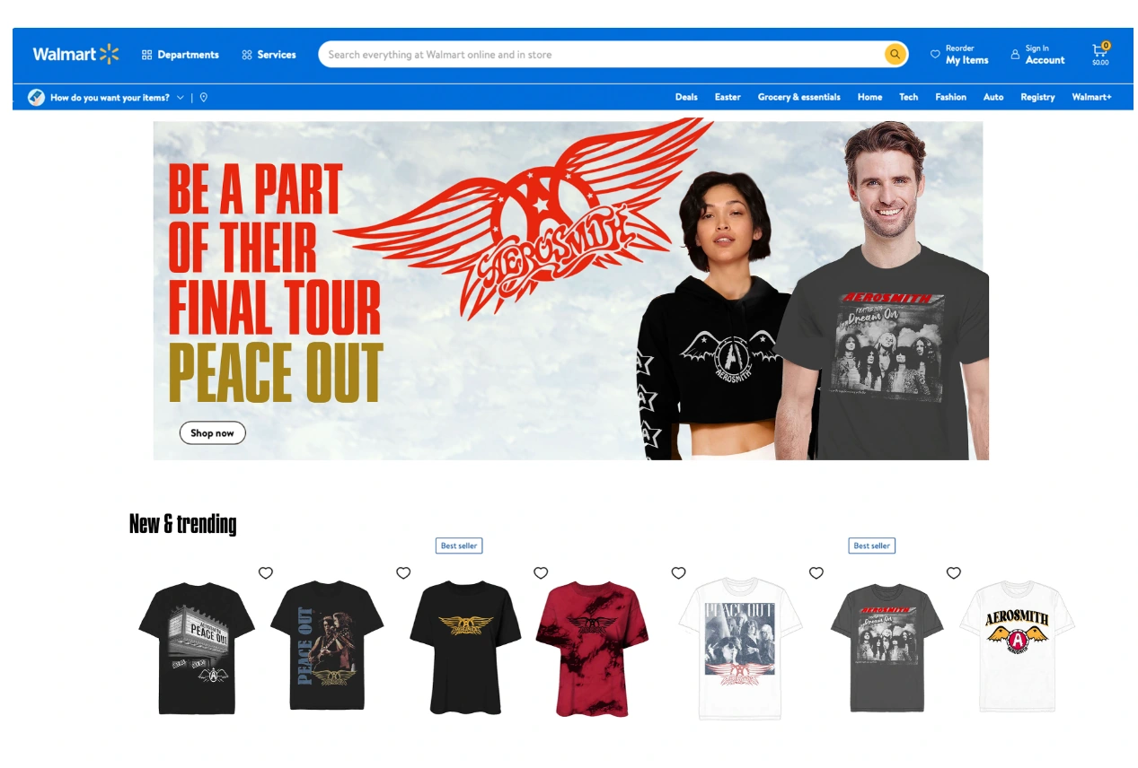
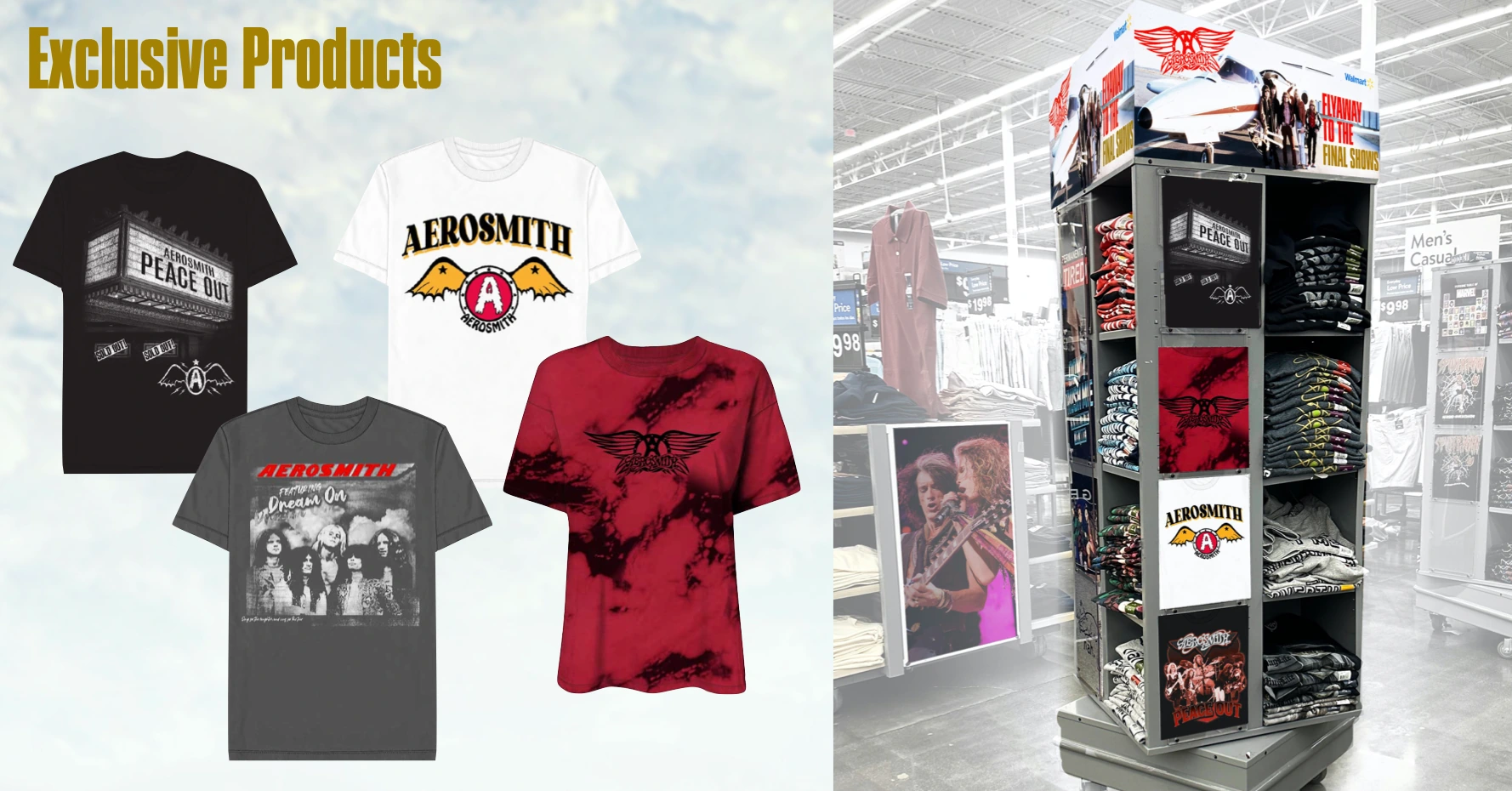
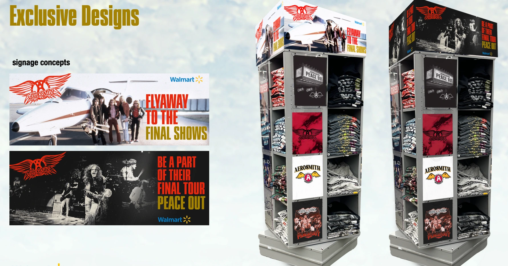
Pitch slides and storefront mockups are shown as concept work.
See the wider retail activation pitch ↗Explore how brand thinking translates into packaging, apparel, and environments.
Explore the full portfolio ↗